First time user experience
First time user experience (FTUE) and onboarding
First Time User Experience (FTUE) happens when the user first activates or opens your app. It may last just a few seconds (e.g landing pages), or it can take hours, or days until completed. (e.g. complex technical and business products). Your app's UX and design should be able to work in all scenarios where the user first encounters your app (e.g. in game, desktop, etc.). Design each scenario to provide the best possibler first impression and communicate with users effectively and efficiently.
Once your app is installed, the user who has never used it before, needs guidance in order to understand the app’s features. A good FTUE showcases user value and increases the chances of retaining your users in the long term. This section outlines some guidelines that will ensure a good FTUE.
App introduction welcome screen
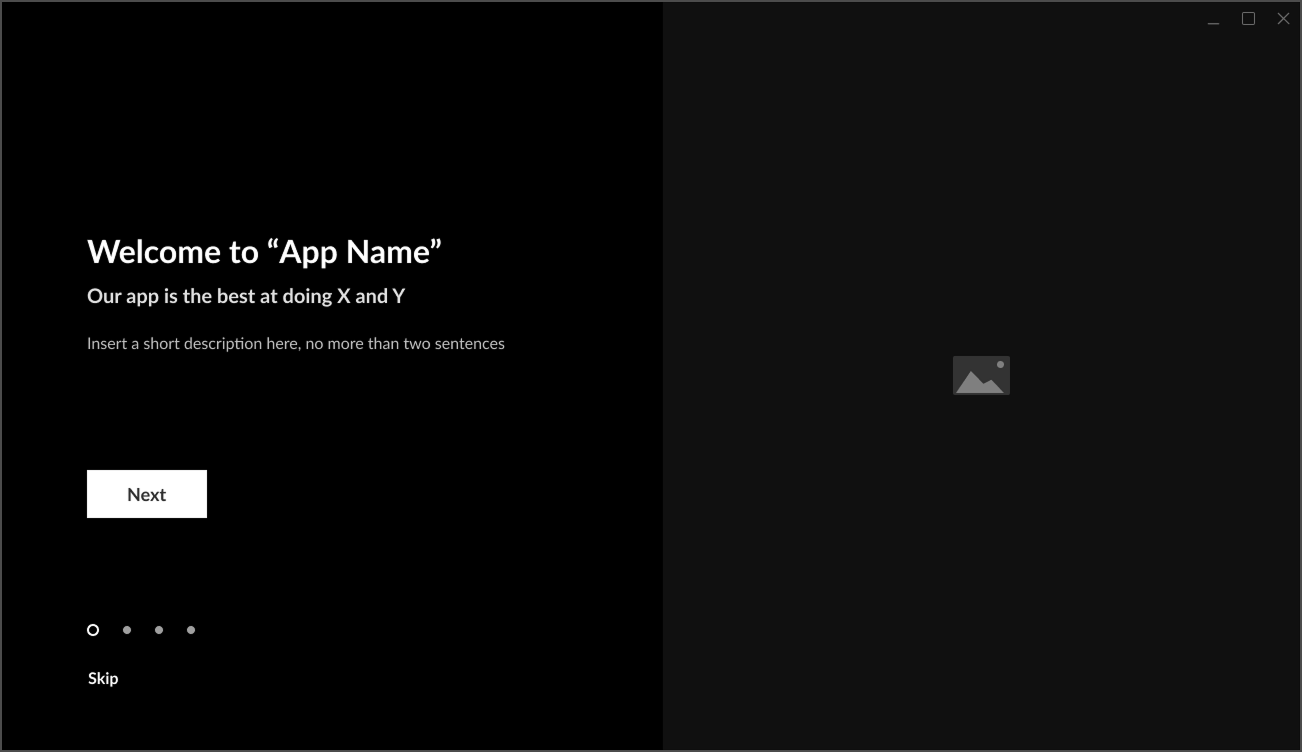
An app introduction is a simple welcome screen that presents the app's core value added proposition and main features. Typically a introduction or welcome screen is launched when the app first opens and helps set expectations and builds excitement. The app introduction is about creating a strong first impression, highlight the *WOW of your app and clearly communicate the app’s most valuable features in an engaging way.
When building a welcome screen:
- Design it around promotional content, user engagement, and conversion.
- Dismissible by adding clear to see skip or close button.
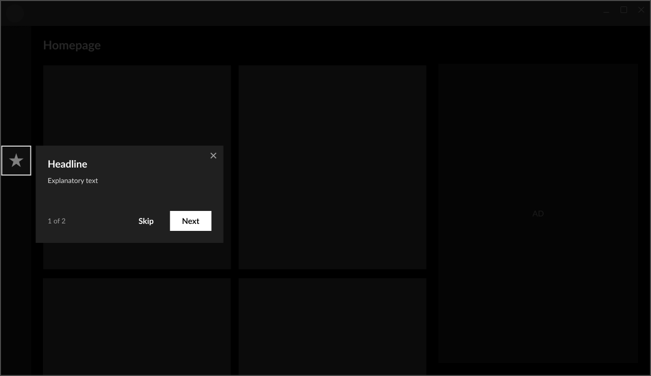
Coach marks
Coach marks are contextual hints that appear throughout your app and UI to explain features interactively. Typically they are used when a user first encounters a complex feature or where guidance is needed. Coach marks in an app include tool tips, guided walkthroughs, daily tips at app startup, and other forms of interaction that show the user how to use the UI or explain how to use a feature. You should make your coach marks dismissible using an enable/disable option in the app's settings.
Coach marks can also be an instruction page detailing the main app features and explaining what the user should do to start using the app. A single page on how to configure the app or sign up if needed is engaging and useful.
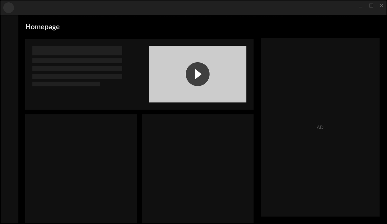
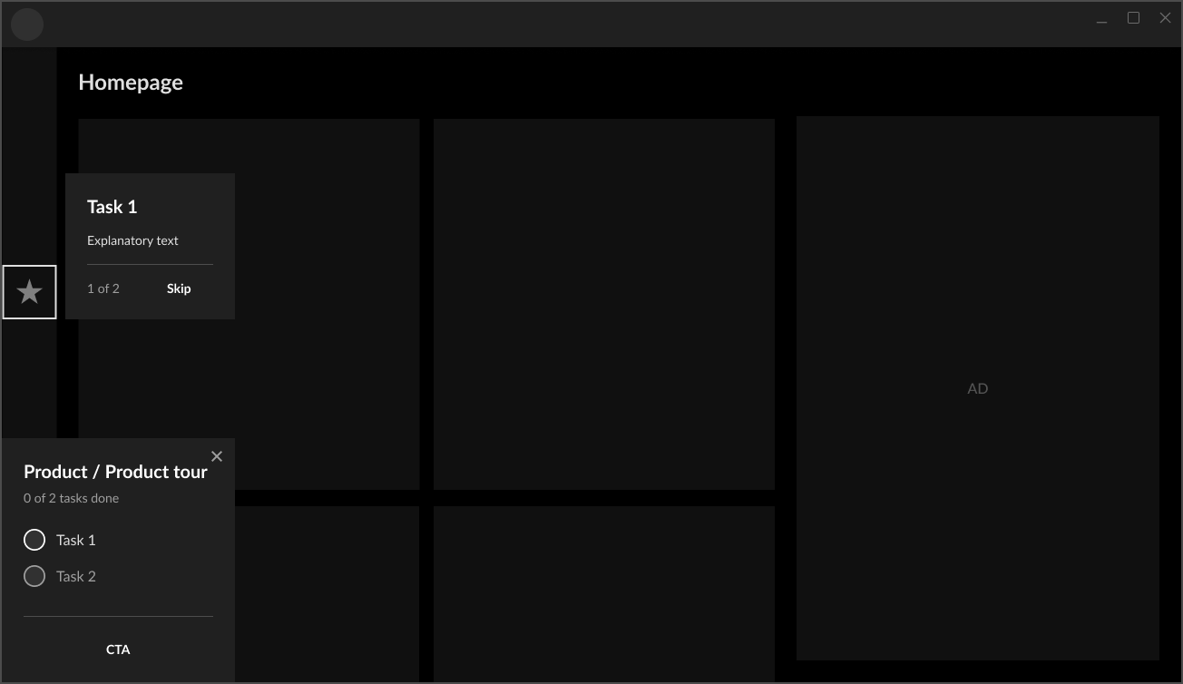
Instructions, demos, and tutorials
Demos and tutorials are hands-on experiences or interactive content that let users actively try out features or watch how they work (e.g., configuring a setting, using an overlay, or watching a quick video). Unlike coach marks which are passive, demos and tutorials are active and are meant to engage the user. Having users interact with a tutorial or demo ensures that they understand the app and its value proposition and is ideal when a feature requires user input or setup. Videos and interactive demos are a perfect way to reduce friction by guiding users through your app and its features.
When building your tutorial:
- Make the demo/tutorial interactive by letting the user perform actions in a simulated app.
- Keep it as short as possible while ensuring your maintain your app's value added messages.
- Allow users to skip or revisit tutorials as needed.
Demo example:
Tutorial example:
Where to implement your FTUE
- Desktop first screen (Post-Installation)—communicate the app’s core value, main features, and purpose.
- Highlight what makes your app valuable.
- Optional log-in/sign-up.
- Keep it brief so that users can start using the app quickly.
- In-Game Experience—guide users on how to use overlays and widgets effectively.
- Use empty states with a short explanation of what to expect.
- Consider a more elaborate introduction for complex features.
- Ensure guidance is seamless and non-intrusive. Users should not feel interrupted.
- Post-Match Screen—introduce analytics, insights, or highlights that users see for the first time.
- Provide a quick overview of key post-game data.
- Avoid over-explaining—make it clear and scannable.
- Introduce offers or premium features subtly.
Finding the right balance
- Don't overwhelm users with excessive explanations. Too much information can be frustrating.
- Make interactions skimmable and skippable. Users should grasp the core message in seconds, and you should always allow them to skip this part.
- FTUE isn’t just for first-time users. Introduce it when rolling out new features even to existing users.
By integrating FTUE strategically, you can improve user engagement, reduce friction, and enhance the overall experience without disrupting gameplay. For examples, see Overwolf's recommended Best practices for FTUE.