Working with ads
This page discusses general information about working with Ads. Once you are done, do also check out the Ads SDK, for an overview of the Overwolf Ads SDK.
When we talk about Ads on this site, we often say that "Ads offer a way to monetize your app seamlessly, without compromising user experience".
But what exactly does this mean? Well, if we're being more specific - Ads allow you to take unused visual space in your app, and "auction" it off to advertisers, who will then use it in order to advance their products.
While this can be very useful as a developer, there are some constraints to the app's design that come with Ads. Mainly:
- Ads cannot compromise the app's usability/design too much, otherwise user experience will be hurt.
- Ads must follow many rigid rules, set forth by the advertising industry.
As such, we have compiled a set of guidelines, to help you integrate Ads into your app's design, with a minimal impact on everything else.
Ad planning guidelines
To better understand the reasoning for these guidelines, and the thinking behind them, see Ads and desktop apps.
First, if you haven't already, please review the available Ad Sizes.
Apart from that, we have also devised a list of Recommended Ads Layouts, which you can use to get started designing.
Now, with all of this in mind, you should select the locations in the app where these Ad containers will be displayed. Keep in mind:
- Any window containing an Ad container, should also have real, tangible and continuous value for the user.
Some examples of where Ads must NEVER be displayed
- App signup/login windows.
- App error/notification windows.
- Windows displaying just the Ad container.
- Ad containers should be positioned in a way that clearly and visually marks them as part of the App's content. More specifically:
- Ad containers should not be placed in their own window without any other meaningful content.
- Ad containers should not be separated from the rest of the App's content by any invisible or transparent spaces.
- Try to keep the Ads as acceptable and non-invasive to the app's overall experience as possible.
- There is nothing wrong with using Ads. However, too many Ads, or parts of the app that feel like they are only there to show more Ads, are the main causes of friction with user experience when using Ads.
- The amount of Ad containers you can use is limited. Use it wisely. More specifically:
- With video Ad containers, you may only have one active video Ad container at any moment per app window.
- Each app window may only have up to (or exactly) 3 active Ads at any given moment (both video and display Ads count towards this limit).
- You may use as many display Ad containers as you want, as long as the total amount of Ad containers in the window stays at 3 or less.
- If a certain app window has several views, try to make sure that Ad containers do not change when moving between views
- This ensures that the containers can stay active, regardless of the current view/changes in the view.
- Ad containers should be placed where they won't be hidden. If your app utilizes pop-ups, try to make sure that these do not block any Ad containers.
- Ad containers should be placed where they will be seen for more than a short moment.
- This can often be achieved by using "dead" moments in games (i.e. loading screens, post-game screens, respawn timers, etc.).
- When using video Ad containers, try to keep the container's continuous visibility duration high, to ensure higher completion rates.
- A good average open time for video Ads is 30 seconds.
- A good average Completion Rate* for video Ads is 70%.
* Completion Rate - measurement of ad completions out of the total ad views.
Ad planning can be a tricky thing. If you're uncertain about any part of it, or just have any questions about it, contact us, and we will gladly help you with planning and implementing Ads in your app!
List of Ad Sizes
The following Ad container sizes are currently supported by the Ads SDK:
| Container size | Supported video Ads | Supported banner Ads | (ow-plat) Size value snippet | (ow-electron) Container min size snippet |
|---|---|---|---|---|
| 400x300 | 400x300 / 300x250 | 336x280 / 300x250 / 250x250 | { width: 400, height: 300 } | min-width: 400px; min-height: 300px; |
| 400x600 | 400x300 / 300x250 | 336x280 / 300x600 / 300x250 / 250x250 | { width: 400, height: 600 } | min-width: 400px; min-height: 600px; |
| 300x250 | N/A | 300x250 / 250x250 | { width: 300, height: 250 } | min-width: 300px; min-height: 250px; |
| 160x600 | N/A | 160x600 / 120x600 | { width: 160, height: 600 } | min-width: 160px; min-height: 600px; |
| 728x90 | N/A | 728x90 | { width: 728, height: 90 } | min-width: 728px; min-height: 90px; |
Make sure to only enter values from a single line of the Size value snippet! Any unsupported values will potentially cause no ads to show!
For specific edge-cases, or if you wish to use several different sizes in a single container, contact us.
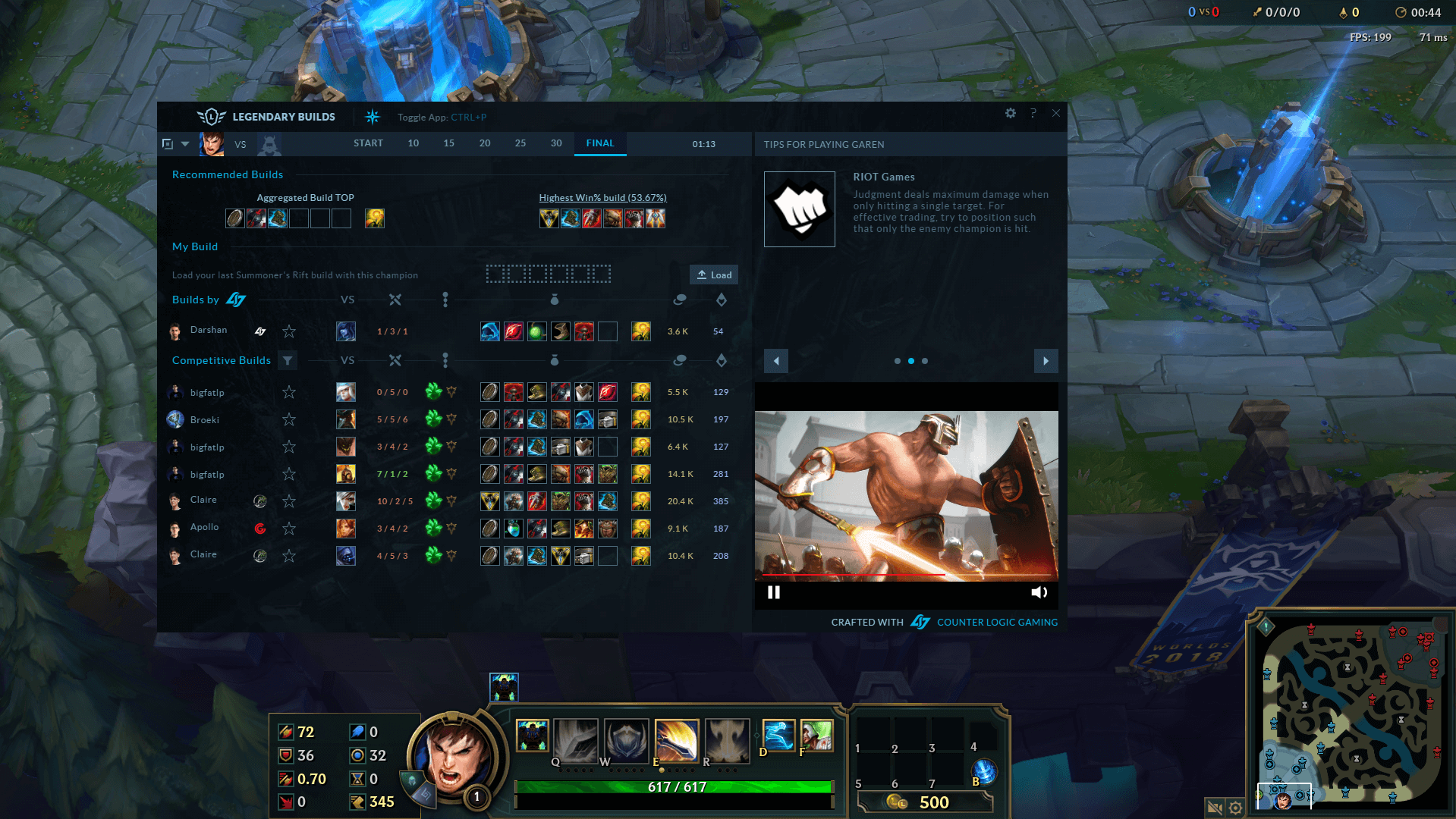
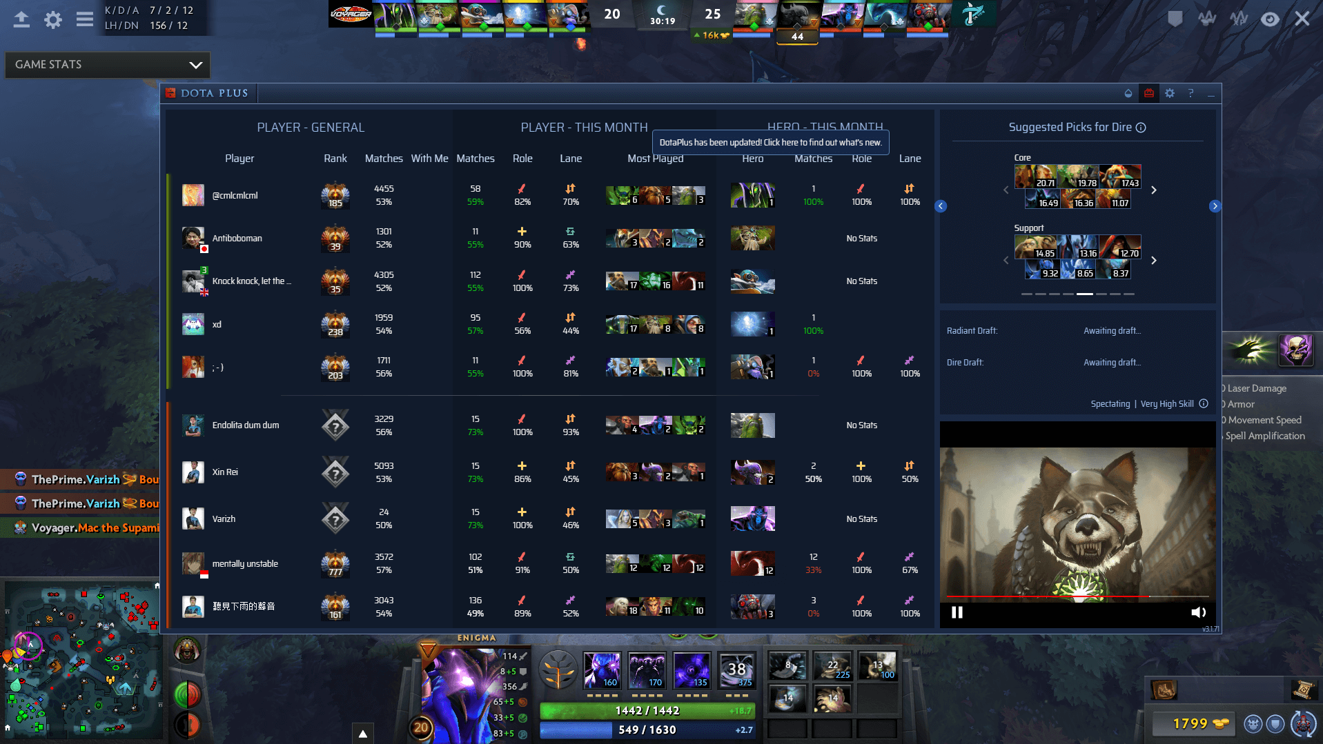
Below are some examples of Ad placements in different apps:
Ads and desktop apps
The remaining part of this page explains the limitations, as well as reasoning, that make up the above guidelines. As such, it is not actually required for Ad implementation.
Displaying Ads in a desktop app brings with it a challenge:
- On the one hand, more Ads in more places would mean a higher revenue.
- On the other hand, both users and advertisers have their limits:
- For users, too many Ads/Ads that interfere with the app's basic functions will significantly hurt the app's usability, causing the users to leave.
- For advertisers, too many low-performing Ads would simply drive them away, along with their advertising budgets.
As such, while ideally in order to display Ads in an app, you would simply define one (or several) places where Ads will be shown and everything else would work itself out, you have to keep the different involved parties in mind.
From a design perspective
Ideally, we would want to use any bit of dead space in the app's screens to display Ads, so that we can use the important space more effectively for the app's features, while reducing the impact on user experience. This would mean putting Ads in:
- Unused margins.
- Empty corners.
- Areas often hidden by other windows.
- etc.
From an advertising perspective
Ads come with many rigid constraints, to ensure that advertisers get a good return on their investment. These most often dictate that:
- Ads must come in one of several preset container sizes.
- Ads must not move while they are playing.
- Ads must not actively compete with each other for the user's attention.
- Ads must always be fully visible.
Bridging the gaps
These constraints, while already conflicted, still don't even fully cover everything that would affect the app's Ad/general performance when integrating Ads. As such, Overwolf also places an extra set of contraints on Ads displayed through the SDK, in order to maintain a healthy environment for advertisers, users, and app developers alike. You can read more about that here.
All of those rules, when combined, make up the Ad planning guidelines, a set of simple rules designed to help you implement Ads into your app properly, while keeping the different constraints in mind.

